

Case Study:
RockShox
Creative Direction, Campaign Ideation, Brand Systems
Creative Direction, Campaign Ideation, Brand Systems
The Brief:
Mountain biking has never rewarded brands that play it safe. RockShox's challenge was staying at the front of a sport built on irreverence, without the identity feeling like it was chasing trends to get there.
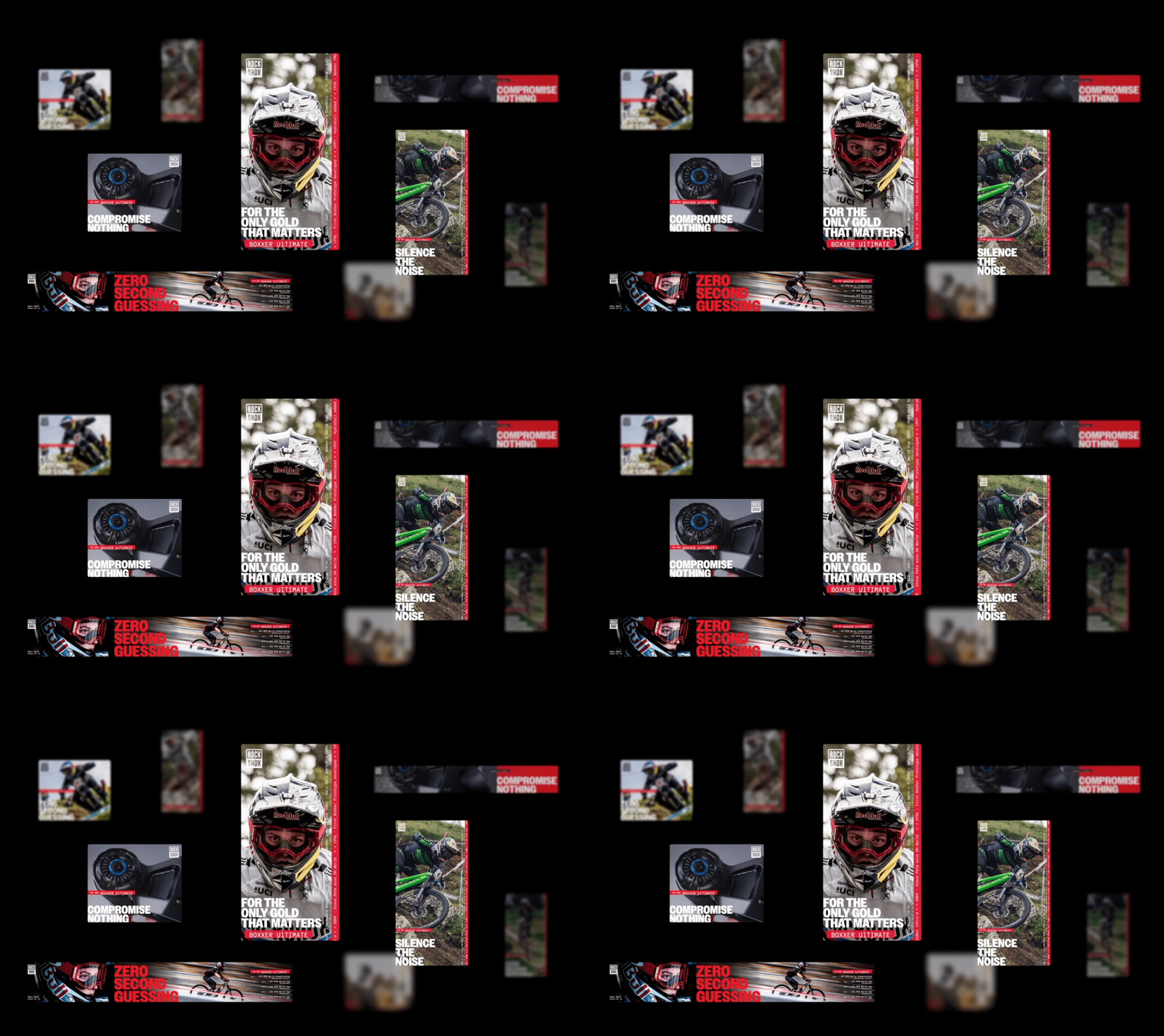
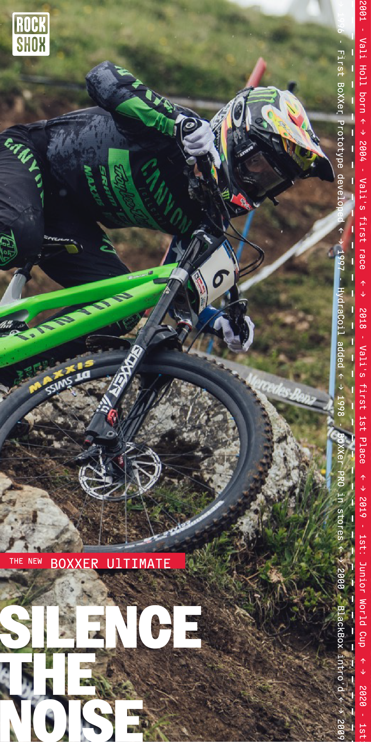
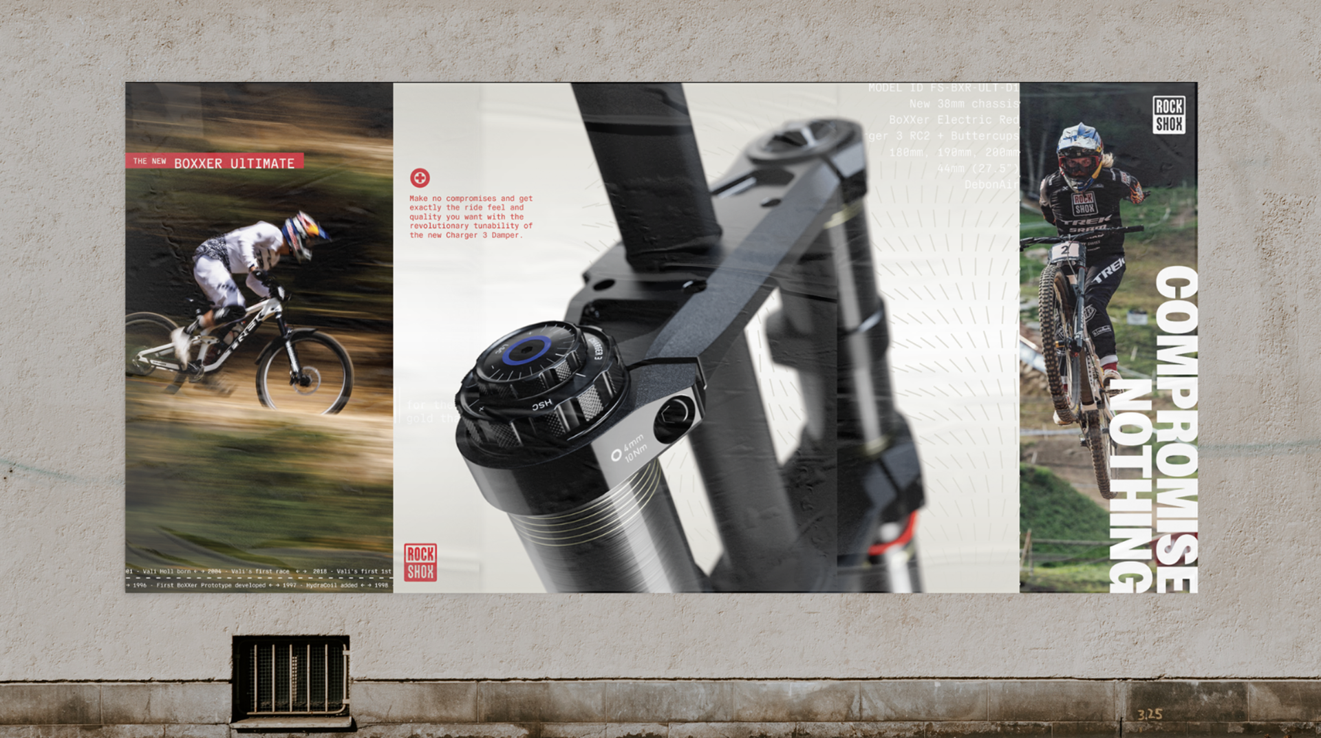
At Owen Jones, we created a system that leans into contrast: precise, engineering-grade graphic devices next to raw rider POV photography.
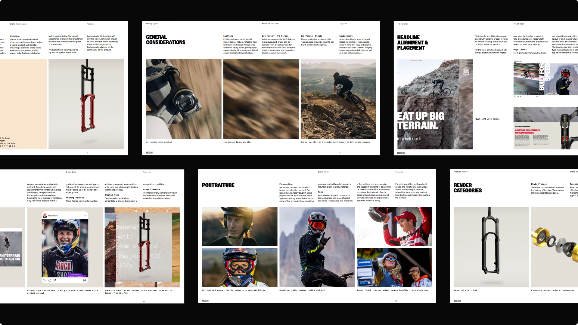
A custom-built graphic generation tool sits at the center of it all, giving the brand a way to keep generating fresh visual output that still feels unmistakably RockShox.
A custom-built graphic generation tool sits at the center of it all, giving the brand a way to keep generating fresh visual output that still feels unmistakably RockShox.
My Role:
I contributed in the early stages of campaign ideation, ensuring brand messaging was told through the visual system buildout.
Our goal was to create a fresh, yet strong, brand image that challenged the ideas of what an action sports should be.
Apps used: Figma, Photoshop, Illustrator, After Effects
Our goal was to create a fresh, yet strong, brand image that challenged the ideas of what an action sports should be.
Apps used: Figma, Photoshop, Illustrator, After Effects
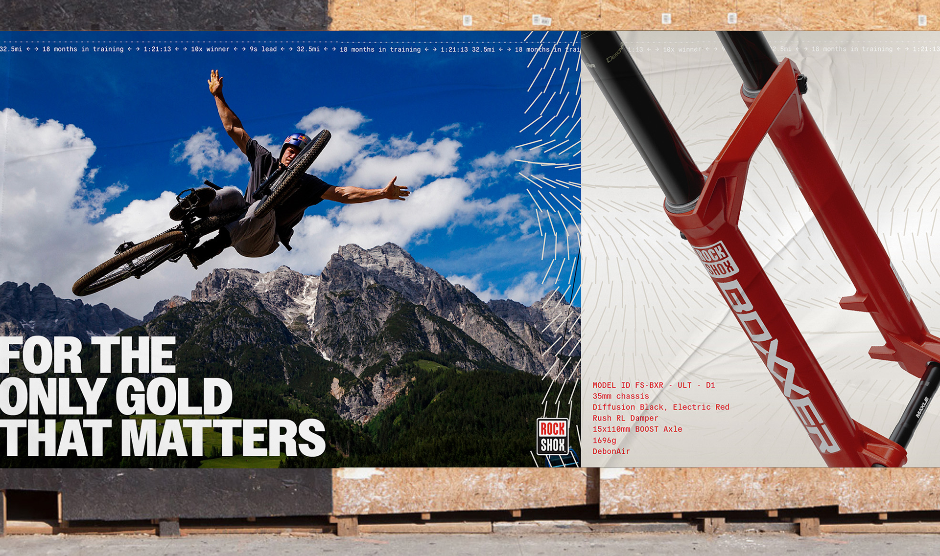
We paired bold photography with detailed product renders for the base of the design, then layered in
product detail text, strong headline type, and organic flow fields for the final design.
product detail text, strong headline type, and organic flow fields for the final design.
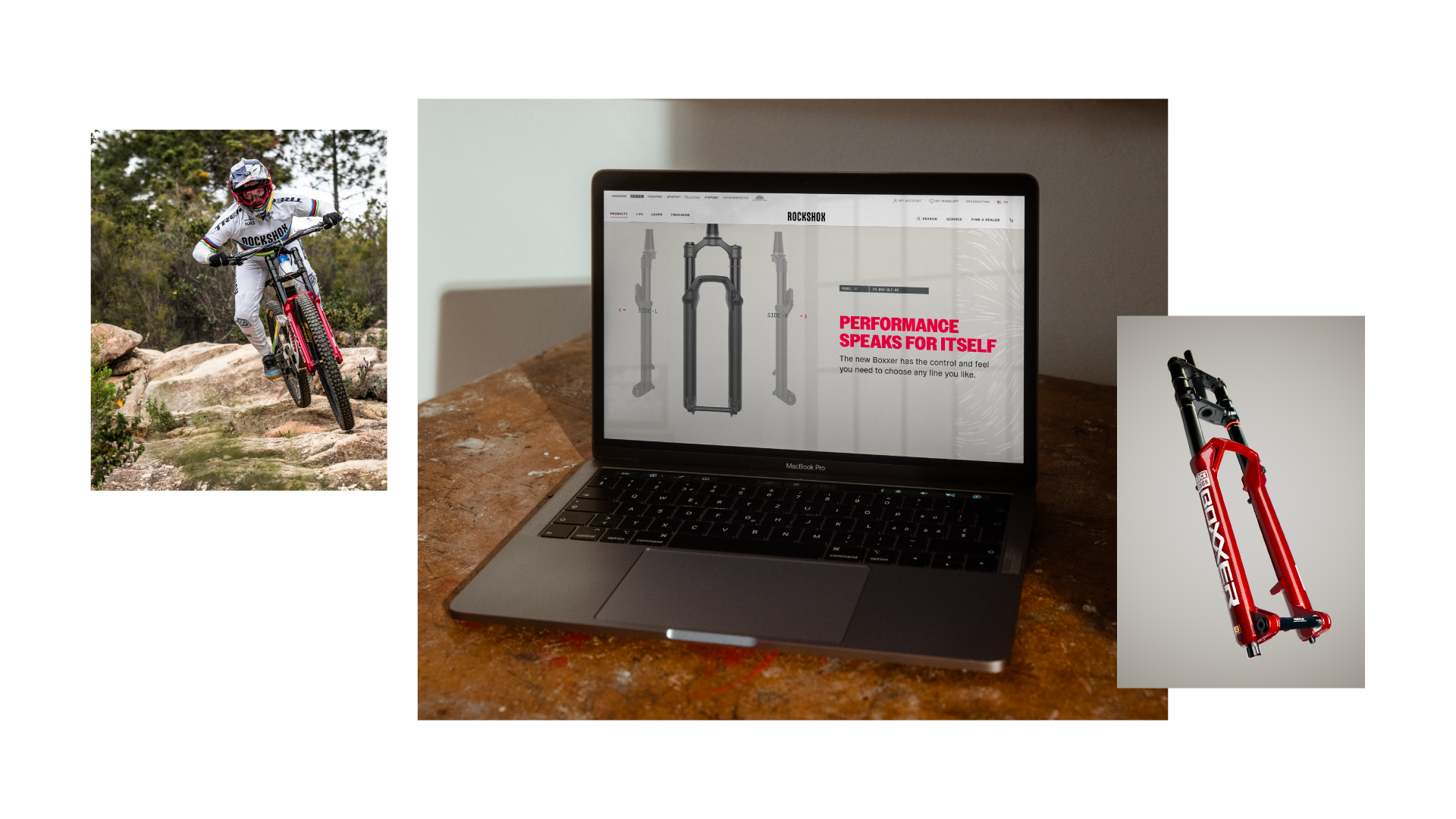
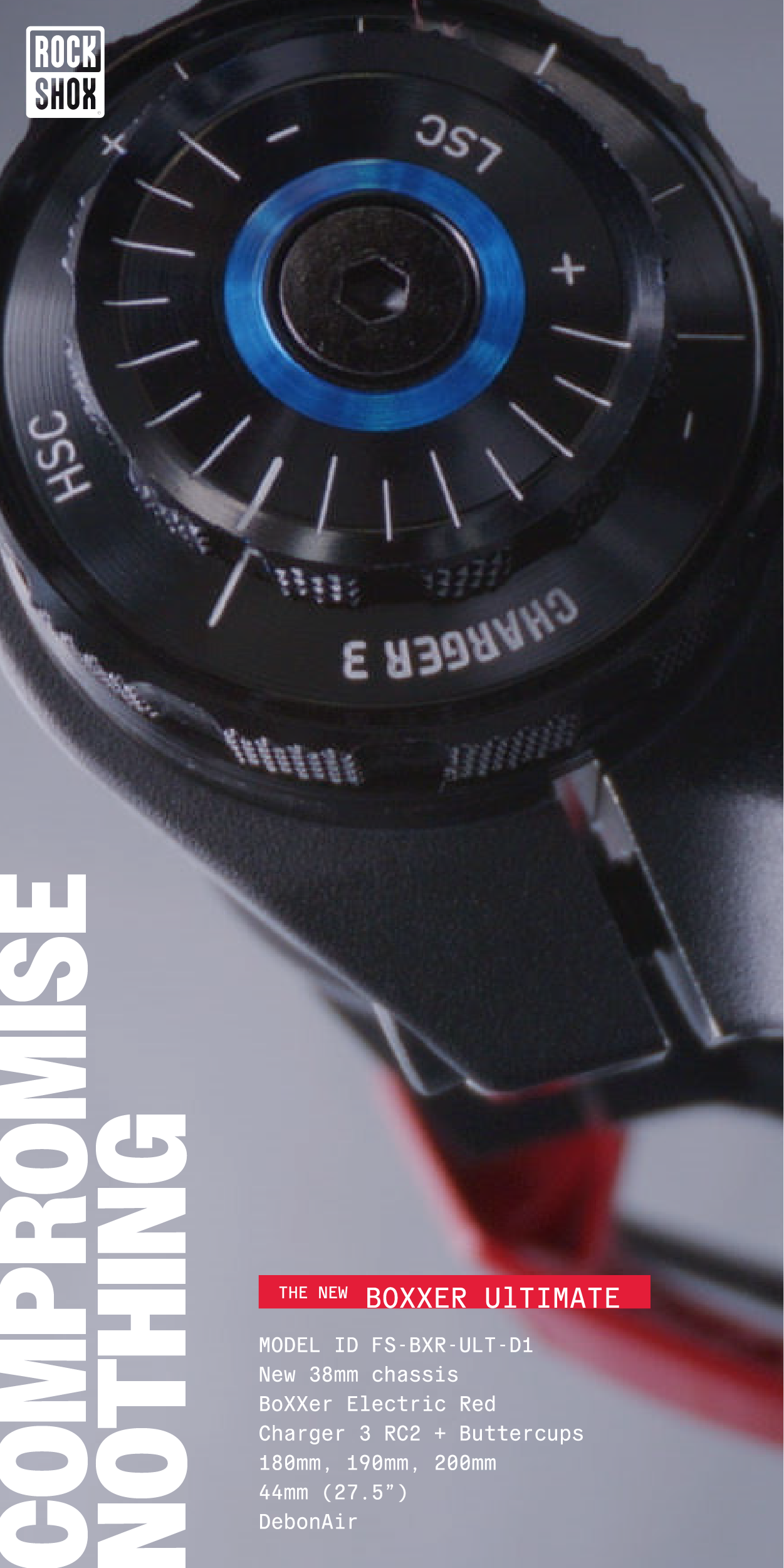
Web banners
The Results:
Our brand blueprint gave RockShox room to stay wild without losing consistency.